

With less than a second to impress your customers with your website, it’s crucial that it’s designed for attention and engagement. Stick to these simple digital marketing hacks and you’ll have the blueprint for creating a stunning website.
1. Always place your logo on the top left
While centred logos are still acceptable (and tend to look better on a mobile device), the top left corner is where the human eye naturally settles. In the words of the Nielsen Norman Group who are dedicated to researching user experience, humans prefer the ‘path of minimum effort’ when it comes to website navigation. Their research reveals that users find it easier to navigate a website that has a logo on the top left.
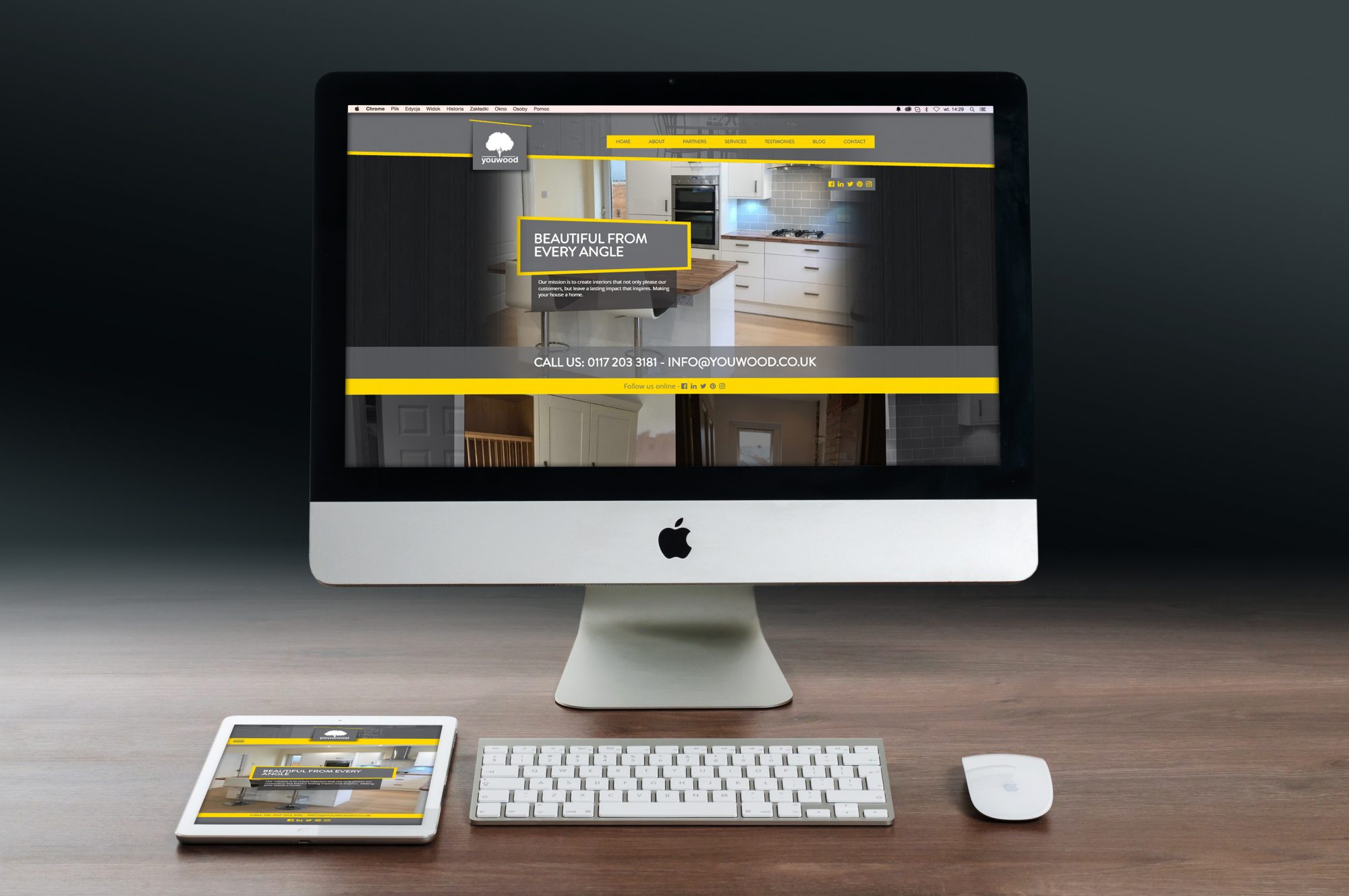
The website we built for our client the luxury interior brand Youwood, with a logo on the left for web display and in the middle for mobile displays.
Make sure that your logo is consistent on each page as you never know which page your customer will land on first! You also need to ensure that every time a customer clicks on your logo, they are redirected back to the homepage. This way you’re killing two birds with one stone – displayed on each site, your logo reinforces brand recognition AND it acts as a navigation tool.
2. Leave plenty of space for background or use an eye-catching image
Cluttered websites are off-putting. “A design mantra of mine is to keep things simple. Less is more,” says George Tunnah, the Head of Design here, at Cre8ion. Having a clean background or eye-catching and purposefully placed images is what you need to build a website that customers will remember. This is the mantra we abide by for all our projects. This includes our clients Digiprint who approached us, needing to reboot their online offering.
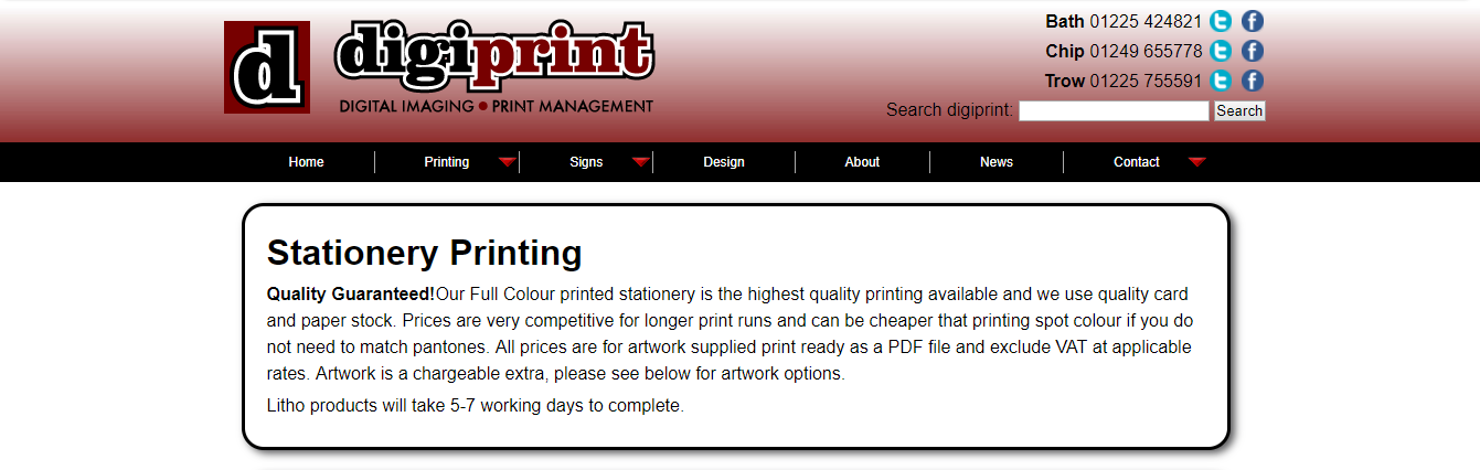
The old website for our clients Digiprint that Cre8ion redesigned.
We provided three brand concepts to deliver the right message, and the team at Digiprint chose the concept of ‘Colouring your world’. It was based around strong black and white imagery with striking colour aspects, while refining their logotype in line with app trends. This creative strategy enabled our digital team to create a cutting edge website for Digiprint where customers can create accounts, log in, shop online, and read regular blog content. This fully responsive website allows people to access the same content as on a desktop on the move, which is invaluable in the fast paced professional world that Digiprint is targeting with quick turnaround business printing.
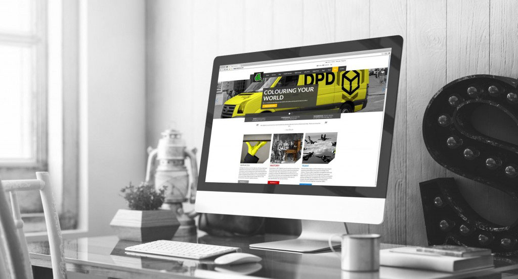
This is Digiprint’s new website.
3. Stick to only two fonts
Simple and elegant web design that catches the eye is not just about how many brand colours or images you’re using. Often overlooked, fonts have an important role to play when it comes to digital marketing. Design for Founders recommend that anyone experimenting with web design should stick to only two fonts on a website – one for the body of the text, and another for the headlines. While at Cre8ion we’re not impartial to a rebel spirit, and like to bend the rules sometimes, we also know the importance of clean fonts. That’s why our editorial and web design teams work together to deliver the right message that looks great visually. This is the process we followed for one of our latest projects Flamingo Jewellery. Combining the efforts of our creative team and our clients, we redesigned the Flamingo Jewellery logo, built their website and created print materials, incorporating their new high end, luxury look.
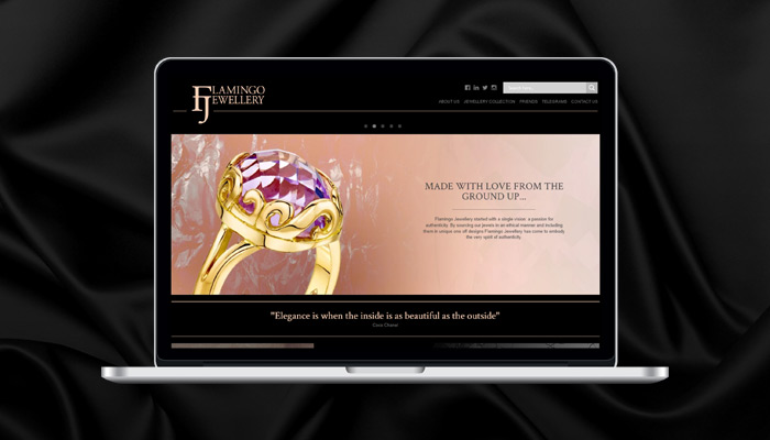
The new website design for our clients Flamingo Jewellery.
4. Have a hierarchy of content
Creating the underlying structure for your website is like building the foundations for a house. Before you can decorate the rooms, you need to make sure that the whole structure isn’t going to collapse. Put some thought into designing the navigation pane before you start writing content and making it visually appealing. Do you know how your users like to navigate a website? Avoid assumptions and use real data, if possible.

Contently’s contributor’s Andrey Popov’s take on the content hierarchy of needs in the field of digital marketing, published in The Content Strategist.
5. Know the strategic aims of your website
Do you know what the overall aim of your website is? Having a clear strategy on what you want the website to achieve will help you design it in a way that targets your perfect customer. It’s always best to sit down with everyone involved to ensure that your views align – this is an approach that we like to use at Cre8ion. Before we start designing a new marketing strategy for our customers, we conduct a workshop where we sit down with their team and discuss where they see the business going.
You can use this simple formula when defining the strategic goals of your website, suggested by Gather Content:
“We want ___ (action) ___ , because ___ (reason) ___ , so that ___ (objective) ___ .”

If you’re looking to redesign your website or reap the rewards of brand marketing, we’d love to help you make your business goals a reality by creating a targeted marketing strategy for your business. Get in touch with our friendly team who will be happy to answer all of your questions.