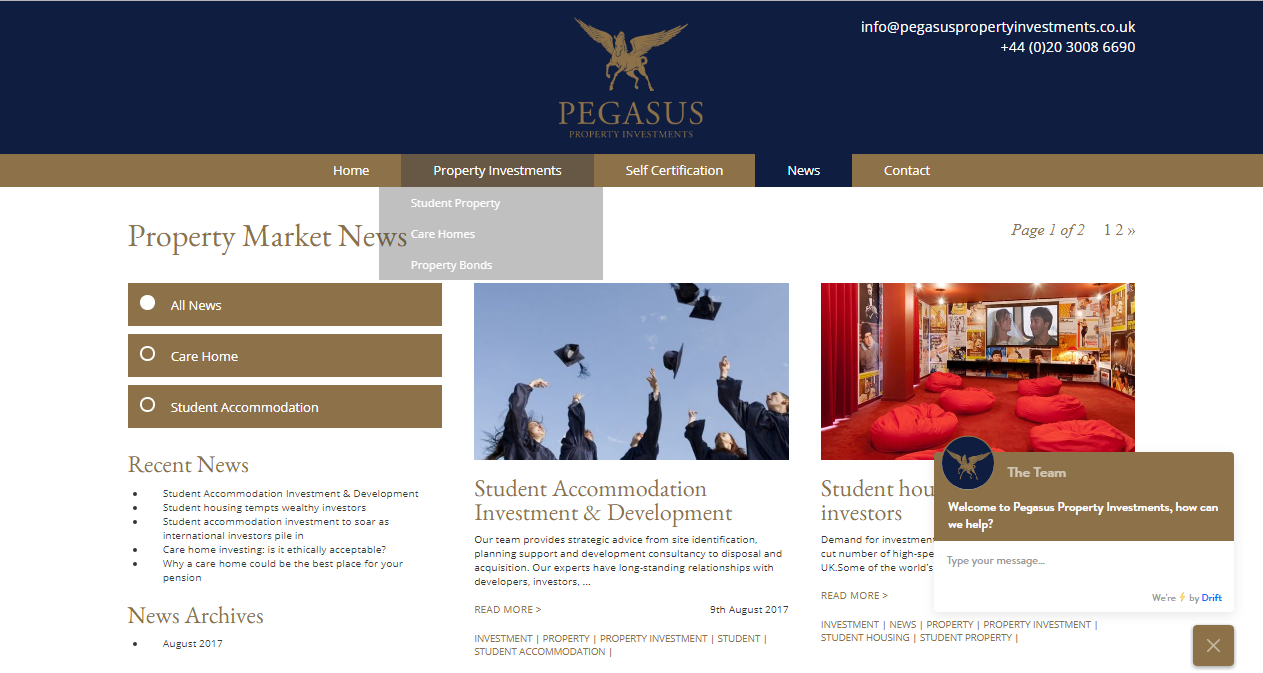
When marketing a property investment business, it’s essential to create a sense of trust and expertise. Let’s take a look at one of our latest projects Pegasus Property to see what colours, fonts and words best convey this message.
Who are Pegasus Property Investments?
Pegasus Property Investments in Mayfair, London is a property investment company that specialises in providing investors with access to a wide range of property investment opportunities. For them, communicating a message of reliability, trust and expertise is paramount. When we set out to work on their new website and branding, it was important to ensure that everything about the brand – from colours and fonts to the type of language that we used – communicated this message to their customers.
https://www.instagram.com/p/BXpalCLHBHd/
Trust and expertise, expressed in colours
In brand marketing, it’s crucial to choose the right colours to communicate a message. If that message happens to be trust, value and expertise then blue and white are generally the colours you want to use. However, since Pegasus Property Investments wanted to present themselves as a reliable, trustworthy as well as a luxurious brand, we chose a colour scheme that incorporates deep colours, complimented with a touch of gold to create this sense of trust and luxury. You can read more on colour psychology on our previous blog post.

Fonts that convey the right message
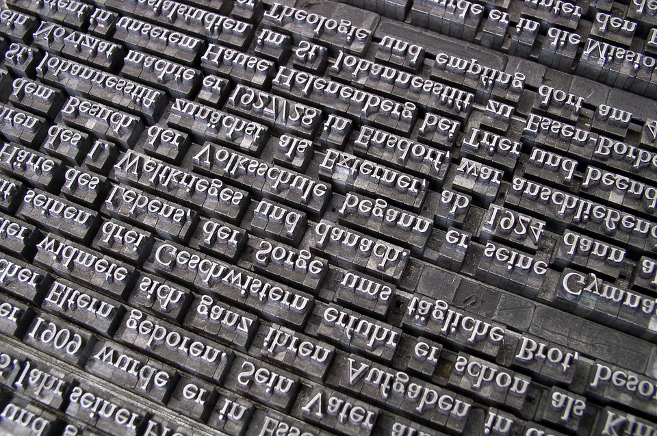
Just like choosing the right colours, you also need to get the fonts just right, or you’ll risk contradicting your brand marketing message. In website design, it is always a good idea to have two different fonts – one for headlines and one for the main body of text. As with any rule, there are exceptions, but if you choose to use more than two fonts, your website may look a bit messy and chaotic.
Since Pegasus Property Investments is an “approachable but informed” brand with years of experience and expertise under their belts, the fonts needed to reflect this. So we chose two classic but contrasting fonts – EB Garamond for headlines and Open Sans for the main body of text – to give a sense of experience and approachability.

Words that speak the language of the brand
Of course, fonts are just the icing on the cake – what’s really important, is the message behind your brand. What’s your mission and vision statement? Where are you now and where do you see your business going over the next few years? These are the questions that will inform the words that you choose to convey your brand message. Having a brand guidebook will help you keep that message consistent, whether you’re posting messages on your social media channels, writing blog posts for your website or designing brochures. For more reasons on why every business should have a brand guide, have a look at our previous blog post.
https://www.instagram.com/p/BZOZZM7negl/?hl=en&taken-by=cre8ionstudios
Over the years, we’ve worked with a number of clients and businesses who specialise in property investment and mortgage. So if you’re looking to redesign your property investment website or wish to boost your brand marketing, trust our expertise and contact us today to see how we Cre8ion help.

