
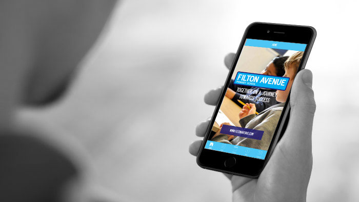
You may have heard the announcement that Google made last April to incorporate a mobile-friendly algorithm into its search rankings, giving a boost to mobile-friendly websites. If you haven’t had time to think about it, the truth is that other competitors are likely to be ahead of the game – smartphone is now the number one device for internet users in the UK, overtaking laptops, according to Ofcom.
Marketing strategy for the mobile user
Adapting your website content for mobile users means more than just upgrading the technology to ensure that your content loads quicker onto a smartphone. It is about re-thinking the way your brand personality works as a whole, placing the way your customers access the information about your business online at the core of your strategy.
While your website and email content may work well on a laptop, and load onto a smartphone effortlessly, it is important to understand that many customers are likely to access it ‘on the go’ on their mobile devices. This means that they are likely to engage with your business on the go as well.
‘Undesigning’ your website may be a better solution
Rather than thinking about how to update your current website to suit the needs of a mobile user, you may want to consider ‘undesigning’ it completely – stripping your website back to basics and rebuilding it with the mobile smartphone user at the very heart of your marketing strategy.
While it may seem like a time-consuming task, with the rate of mobile device and smartphone users, this is an investment well worth taking. What’s more, thinking about your business and content from a different perspective can help refresh the mission, vision and values of your business. Our approach incorporates conducting a workshop with our new clients, where we establish your expectations, define your mission, vision and values. We then deliver three routes for your new creative strategy, leaving you to choose the one you like best – all incorporating the needs of a mobile user.
Client Case Study – Oportfolio
Oportfolio, an award winning personal mortgage company based in London, wanted to take their website up a level by further enhancing new and exciting clients’ mortgage needs online. This saw us build a website that allows users to complete mortgage applications online at just the click of a button ‘on the go’. Complimenting this great website, our dedicated editorial team now write a regular blog content for the website that passes legal compliance regulations in order to be used in the context of the website, keeping clients informed and SEO results high.
Check out the website: www.oportfolio.co.uk or contact us today to find out how we can help your business adapt to customers ‘on the go’ and emerge on the other end of ‘mobilegeddon’ safely.