Nightmare Design Fails.
Here are five design mistakes that you absolutely need to avoid or risk scaring off your customers!
1. Comic Sans:
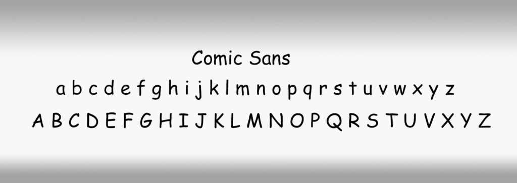
Only acceptable if you are a clown. Avoid at all costs. It’s not funny or clever or even retro.
Closest to it that we could live with is BrushScript but that really is because of our fondness for “Neighbours” in the Scott and Charlene days!

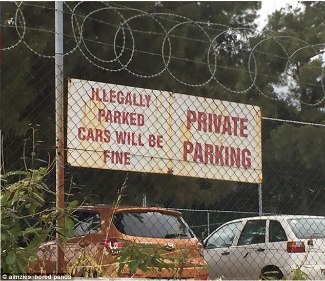
2. Spelling Mistakes
Yep. It sucks! We’ve all been there. Get someone else to review.
Use Spell Check if you are having to write copy yourself and make sure you’re using UK English.
Nothing worse than a proofread American article when it’s for a British audience.
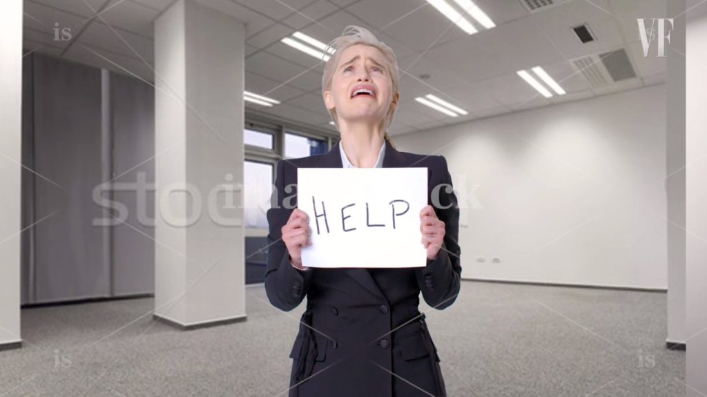
3. Lazy Stock photos.
There are loads of stock shot libraries but just dropping in staged shots makes your brand look poor. On Twitter, Dark Stock Photos show you the amount of rubbish that’s out there whilst being mildly entertaining at the same time! Avoid.
4. No white space.
When you cover a page with too much information no one will read it.
Less is more. If it takes you 2000 words to get your message across maybe you need to write a book and not an ad.
5. Clip art.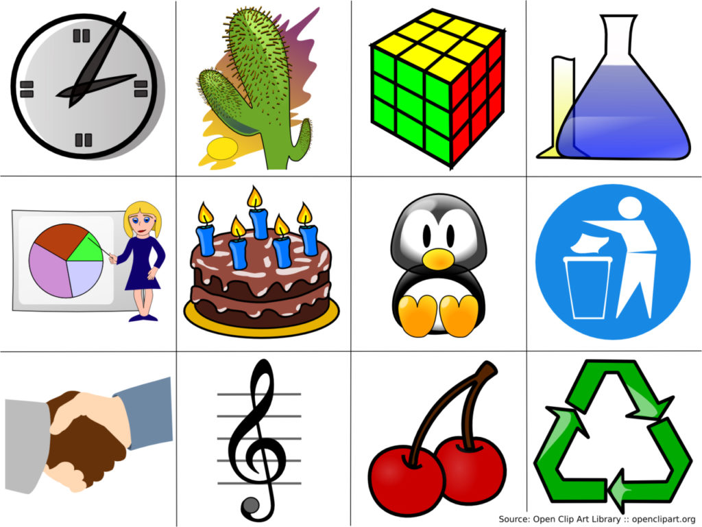
Seriously in 2018 clip art is a dying art…… but somebody, somewhere has found a CD and a computer that can actually use one and is, even now, choosing an image that will scar all who view it. No! Stop. It’s not 1990.
We would be interested to hear your design nightmares!!! Let us know. We’ll share on social media!!
Images taken from www.boredpanda.com