Ever wondered what the difference is between a font and a typeface, or indeed which typeface you should be using for your business cards? Well, wonder no longer, read on to discover some graphic designers’ secrets!
What is the difference between a font and a typeface? Are these terms interchangeable?
They used to mean the same thing, although, strictly speaking, the typeface is the design and the font includes the design, style and size. So, 12 pt. Calibri bold and 26 pt. Calibri italic are different fonts but the same typeface.
How do I decide which typeface to use? Are there different categories which suit different applications?
1) Serif: Serif typefaces have little “feet” or lines attached to the ends of their letters making them look more serious or traditional (think Times New Roman). Use them when you need to establish history, authority, quality and class.
These typefaces have often been used in print for longer passages as they help your eyes to move along the line of the text. Have a look at the typeface used in the novel you are reading or a broadsheet newspaper, it’s probably a serif.
2) Sans-Serif: (sans is French for without) so “without serif” — these typefaces don’t have little feet or lines at the ends of letters, making them look more modern and streamlined (think Arial). Sans-serif typefaces are used in print but more often used for web and social media as they display better on pixel-based screens, they look crisper than the serifs.
3) Script: Scripts are in cursive or handwriting style, the letters generally connect. Lucinda Handwriting is a good example.
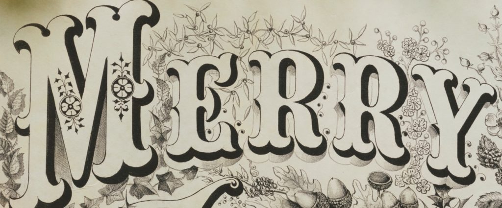
4) Decorative / Display: This kind of typeface is designed to grab your attention and should only be used in small doses, as clarity might take second place to overall effect (think Jokerman). This is the kind of font you would use for a title or anything with a limited number of words.

So how do I know which one to use?
Use different typefaces for display copy (titles) and body copy. Some typefaces lend themselves better to body copy as they are not distracting and easy to read. Other typefaces should only be used for display as they are distracting and will not be appropriate for longer passages. A general rule of thumb is the more versatile the typeface the better it is for body copy – does it come in bold, regular, light, italic etc.?
When choosing a font for a project check that it matches the message or purpose of your design. Who are your audience? Is the typeface appropriate and appealing to them? Where are they coming from? What kind of impression do you want to make? A business card advertising a solicitor needs a typeface that says trustworthy, grounded, conservative, not lighthearted, flamboyant or playful.
Will the font fit the purpose? A business card, for instance, will need a typeface that can be read easily at a small size. Will it work on social media? Sans-serif choices are crisper when pixelated. Is the font versatile? Will it adapt to its surroundings if necessary?
What if I don’t like any of the typefaces available on my laptop? Good news! You can download many typefaces for free at Font Squirrel, Google Fonts, DaFont or 1001 Font. Just check the licensing on the site as some free fonts have restrictions on what they can be used for or how many times you can use them.
If you need some help with getting your game/typeface on then contact one of our Design team who have years of experience in winning titles and a body to copy…
Reference
https://www.canva.com/learn/font-design/
Tony Seddon “Type Teams”

